DESE releases new way to see school district data
While the future of education reform initiatives in the state capitol building is still uncertain, education advocates can celebrate an initiative by the Department of Elementary and Secondary Education to make important school district data easier to see and understand.
DESE’s new “Data Dashboard” is a major improvement from the byzantine collection of spreadsheets that parents used to have to navigate through when looking to compare school district performance.
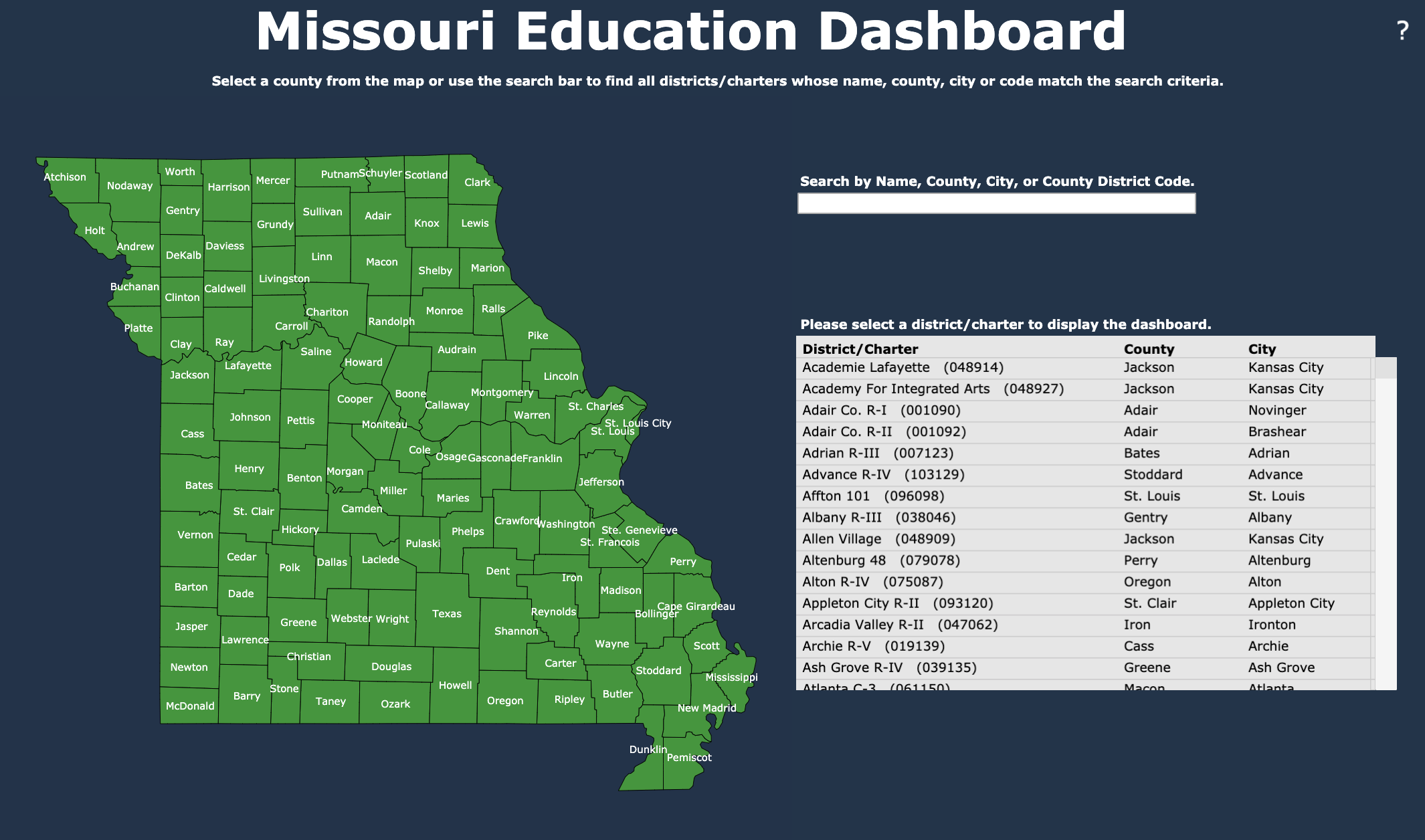
While it is still far from providing a report card for the quality of each school, the new dashboard lets parents easily identify all of the school districts in their county or city, and then quickly see how students are doing on key metrics like state tests, graduation rates and ACT scores.
The new portal is featured on DESE’s website, and can be found here, and starts off with a map of the state and a search bar. If users know what school district they are looking for they can enter it into the search bar, or they can click on any county in the state and get a list of districts and public charter schools in that county to choose from.
Once they have selected a district or public charter school, users are presented with a snapshot of the school which includes:
- Student population data
- Expenditures per student
- Dropout rate
- Mobility rate
- Free or reduced lunch rate (a measure of student poverty)
- ACT scores
- MAP scores
- Statistics on teachers (including student/teacher ratios, average salary, and retention rates)
- and, for high schools, information on what students do after leaving the school
Users can hover each of the categories to learn what the statistic measures or they can click on any statistic to dive deeper into that data (if available) for the distrcit.
Things that still need to be improved
The new dashboard is a major improvement in visualizing education data on a district or LEA level, but it really needs to move to the next step of providing easy to access school level data.
Ideally the dashboard would allow users to see all of the schools on a map and select several to compare data between so that parents can make real, informed decisions about where they are sending their children.
If you would like to learn more about how the new dashboard works, watch the video below.